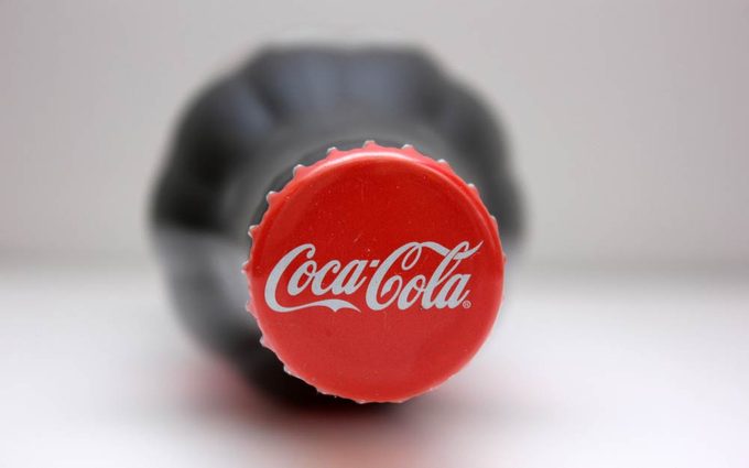
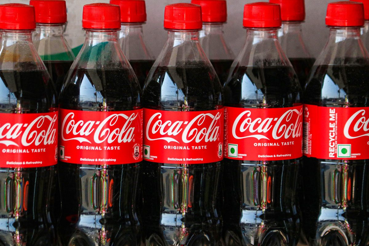
We all recognize that iconic logo, but it wasn't always a classic cherry color. Here’s the real reason why the Coca-Cola logo is red.

Why Is Coca-Cola’s Logo Red?

Coca-Cola and the color red go together like peanut butter and jelly, milk and cookies, or tacos and Tuesdays. After all, who wouldn’t recognize that iconic red logo? In the age of constant brand revamps, Coca-Cola has maintained its color scheme for over eight decades—at least since 1941, when the company adopted the red hue for good. But for many advertising and design enthusiasts, the question remains: Why is Coca-Cola’s logo red?
Many brand logos have hidden messages or stories behind their design, and Coca-Cola’s is no exception. There’s a reason the company has stayed loyal to that familiar shade of red through the decades. Read on as we take a closer look at how the logo has evolved over time and why the color has remained such a big part of the brand’s identity.
Get Reader’s Digest’s Read Up newsletter for more knowledge, tech, travel, cleaning, humor and fun facts all week long.
Why is the Coca-Cola logo red?
Most of us grew up knowing Coca-Cola by its signature logo featuring either red text on a white background or white text on a red background (as in the white Coca-Cola you might see across a red bottle cap). But here’s an interesting fact: The company first introduced a red logo way back in 1891, only to switch back to a black-and-white color scheme just two years later. It wasn’t until 1941 that the red logo made its big return—and this time, it stuck.
Some claim that the red color came from one of the company’s first advertisements, which featured Santa Claus wearing his famous red-and-white suit and holding a Coke bottle. But according to the Coca-Cola Company, its famous logo dates back to the very beginning of the brand itself.
Here are some reasons why Coca-Cola’s logo is red:
The tax benefit
Let’s be honest: Everyone loves paying a little less when it comes to taxes, so why wouldn’t Coca-Cola? According to a report by The Sun, over 130 years ago, Coca-Cola was sold in barrels at American drugstores and pharmacies. Alcohol was distributed in the same way. But while alcohol was taxed at the time, soft drinks were not. So the company began painting its barrels red in order to help customs and tax officials distinguish them from barrels of booze.
That may be why red became the company’s go-to color—and how customers came to recognize it on sight. As for why the red stuck around, well, there are a few more reasons for that.
The yellow-red theory

Ever wonder why so many food and beverage companies use yellow and red in their branding? There’s some science behind it. According to a study published in the Journal of Education Humanities and Social Sciences, people prefer foods with warmer colors (like red and yellow) compared with cool-toned colors (like blue and green). It is also widely believed in the advertising world that red evokes appetite and a sense of urgency.
There’s a good chance this is part of the reason why Coca-Cola has a red logo (and probably why McDonald’s is red and yellow too).
The brand memorability
Probably the most credible reason why Coca-Cola’s logo is red comes straight from the company, and it has a lot to do with brand memorability.
“It goes all the way back to the beginnings,” says former Coca‑Cola archivist Ted Ryan on the company’s History page. When the initial logos were being shaped, Frank Robinson, who crafted the iconic Spencerian script, tried out versions with red letters on a white background. Eventually, the shade and shape stuck with the public—and the rest is history.
While the beverage sees occasional packaging changes for its diverse products, such as the different-colored labels for its Diet and Light variants and yellow caps, the logo color remains red due to its “one-brand” strategy. The Coca-Cola Company recognizes the trust, faith and familiarity consumers associate with the color as a “promise” and even calls it its “second secret formula.”
Ryan put it best: “You see a red disc icon on a storefront, and you know that you’ll be able to get delicious, ice-cold Coca-Cola there.”
How has Coca-Cola’s brand logo changed over the years?
It may come as a surprise that the iconic red logo many of us love and recognize didn’t appear on the original bottle of soda. Since 1893—when the company first registered its logo—the Coca-Cola logo has gone through more than a few transformations. From the initial color scheme to the typography, the Coca-Cola logo evolution has helped the brand grow with the times.
Font changes
In 1886, the very first Coca-Cola logo was simple, set in a serif font and all caps. Just a year later, it got a stylish upgrade. In 1887, the logo adopted a swirlier, more distinctive script that’s still closely tied to the brand today.
That elegant font is called Spencerian, a popular handwriting style of the time. The man behind the iconic script wasn’t Coca‑Cola inventor Dr. John Pemberton, though. We have his bookkeeper, Frank M. Robinson, to thank for the iconic font; he suggested that the two c‘s would look attractive in advertising.
The decades that followed saw plenty of variations of the Spencerian font in the logo: extra swirls, changes in placement and adjustments to letter-spacing. The font changed only once—in 1985, when it featured the word Coke in chunky lettering.
Design changes
Over the years, the Coca-Cola logo has featured different punctuation marks: a period at the end of the word in 1886, an inexplicable comma after the word in 1889 and 1890, and the characteristic hyphen between Coca and Cola (which eventually became much shorter and slanted).
The logo itself has been placed inside shapes like a rectangle, a convex curve and even a square. Several versions also included extra text, like “enjoy,” “real” or “trademark,” each added at different points in time.
But despite all these updates to the Coca-Cola logo, the color red has clearly held its ground.
FAQs
What Pantone color is Coca-Cola red?
According to the Coca-Cola Company, you won’t find this beverage’s famous hue in any Pantone color registry. Some sources claim that it is actually a combination of three different shades of red. However, if you’re looking for a close match, Hex color No. F40009 is your safest bet, according to U.S. Brand Colors.
Who designed the Coca-Cola logo?
Frank M. Robinson, who was Coca‑Cola inventor Dr. John Pemberton’s bookkeeper and partner, has been credited with the design of the Coke logo. Interestingly, he coined the brand name Coca-Cola as well.
Why trust us
At Reader’s Digest, we’re committed to producing high-quality content by writers with expertise and experience in their field in consultation with relevant, qualified experts. We rely on reputable primary sources, including government and professional organizations and academic institutions as well as our writers’ personal experiences where appropriate. We verify all facts and data, back them with credible sourcing and revisit them over time to ensure they remain accurate and up to date. Read more about our team, our contributors and our editorial policies.
Sources:
- The Coca-Cola Company: “Coca‑Cola Red: Our Second Secret Formula”
- Business Insider: “There’s a reason Coca-Cola’s branding is red — and it has to do with booze”
- The Sun: “This is the real reason Coke cans are red … and it has nothing to do with Christmas“
- Journal of Education Humanities and Social Sciences: “A Study on the Effect of Color on Human Food Perception”
- Looka: “The Evolution of the Coca-Cola Logo and Its Timeless Appeal”
- The Coca-Cola Company: “Haddon Sundblom and the Coca‑Cola Santas”
- The Coca-Cola Company: “How was Coca‑Cola invented?”
- U.S. Brand Colors: “Coca-Cola Colors”


